The Originals
 There’s a bit of irony in the title of The Originals. Despite the futuristic trappings, it’s a rather thinly disguised story about teenagers in 1960s England. The Orginals ride hoverscooters and their parkas have evolved a bit, but they’re obviously Mods. Likewise the Dirt ride hovercycles, but the leather jackets are the same ones the Rockers wore. And the popular holiday spot at the Water (a structure built to protect the drinking-water supply from ecological contamination) is just a post-modern version of Brighton. So the milieu isn’t exactly… original.
Likewise, the story is something of a classic coming-of-age story, about a teenage boy who achieves his dream of being accepted by the “in” crowd, but finds that it changes his life in unexpected ways. There’s the New Girlfriend who makes him want to be a better person, the Lifelong Best Friend who endures his diminishing attention, and a variety of other stock characters. Some of the plot developments, like the boy making money selling drugs, or him being away with his girlfriend when Shit Goes Down and his buddies need him, feel like I’ve seen them before in the movie Quadrophenia and other stories of this type.
Maybe the irony is intentional. Although he’s obviously a bit nostalgic for the 60s of his childhood, Gibbons is old enough now (heck, even I am) to see that each generation of teenagers naïvely thinks that they invented style, rebellion, or coolness… that they’re “the originals”. And yet here’s a bunch of young people evidently repeating the same old patterns from a previous century. In fact, so little has changed that the story could be reverted back to the 1960s just by touching up the art; the story is not affected in any substantial way by the future setting.
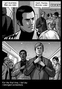 Fortunately, whether Gibbons is trying to make a statement or if he just wants to do a Mods-vs.-Rockers story with spiffy looking futuristic scooters, he does it well. The art is unsurprisingly excellent; Gibbons does a fine job of rendering characters with simple linework, and yes: he draws some spiffy scooters. The choice of black and white (mostly dark grey, really) for the art helps give it an dingy post-industrial feel and evokes the television coverage of the {ahem} original Mods-vs.-Rockers violence. The captions are all kept out of the panels, which often float in a black negative space that adds to the literal darkness. So even in the daylight scenes there’s a sense of foreboding. And the story itself, while not altogether original, is executed well; if this were a reader’s first exposure to this sort of tale, he would have no reason to be disappointed.