Fusion anthology
 There’s no mistaking that the creators of Fusion Anthology have put a lot of time, effort, and money into this project. The production values and packaging alone shout “commitment”. Which makes it all the more baffling that they didn’t bother with a good proofreading. There are some good things to be said about this project from Dominion Publishing. There’s talent to be found here, and some interesting ideas. But they’re undermined by a host of problems, large and small.
The first thing to notice about this book isn’t the book itself, but the box it comes in. That’s a bit of problem right there. It’s a plastic case they call “N-case” similar to a DVD case, but at the dimensions of a comics-industry standard graphic novel; the book itself is slightly smaller than this, to fit inside, along with - at least for this release - an assortment of posters, trading cards, and a booklet containing the kind of “behind the scenes” material that once would have been included in the back pages of monthly serials. Those kinds of extras seem fairly pointless to me, but I can see that they’d appeal to many people, particularly the younger audience this book aimed at. And it’s noteworthy that they’re not trying to do serials, but going directly to graphic novel format. But the sealed case makes it impossible to flip through the book before buying it. (They say that the N-case is patented, and since there’s nothing noteworthy about the design of the case itself, I can only assume the patent applies to the use of a plastic box to package a graphic novel. Oy… don’t get me started about what a mess the patent system has become.)
Once you get inside the box (which is easy enough; it is a well-designed box, I admit) and set aside the inserts, there’s the book itself. It’s 64 pages in full color, and includes 8 short pieces featuring characters from the Dominion universe, ranging from 4-8 pages each. That’s right: I said “universe”. Despite being set in more than one place and time, with their various fantasy/sci-fi/superhero genres, these stories are linked by the presence of a mysterious hand-sized glowing green sphere. They may have conceived of this before CrossGen came along with their interplanetary sigils (the publisher’s web site includes a history and copyright notices going back deep into the 1990s), but I’d think that CrossGen’s poor luck with that angle would have lead Dominion to drop it. And the fact that all of these are essentially teasers and trailers for promised-upcoming features - with no conclusions - makes the whole package an unsatisfying read.
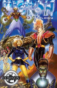
 The art is done by several people, so it’s hard to make generalizations, but there’s definitely a lot of wild action and new-school rubber-skeleton anatomy. Not my cuppa, but OK if you’re into that. But there are often visual storytelling problems. Looking at the page reproduced here, I really can’t tell what order to read the panels or the captions and dialog in. There’s nothing wrong with abandoning the grid approach to laying out pages… unless you don’t know how to work without a net. In another story, we see a close-up of a woman putting what looks like dry creamer into a cup of coffee, a shot of her taking notes in the foreground with her back to her teammates who are telling stories around a campfire (I think; they were partially obscured), then the guys are all unconscious and she stands above them ready to leave them. It took me a minute to guess that it wasn’t creamer, and that the guys drank the coffee (which wasn’t shown in the middle panel)… it’s nice that comics gives the reader the ability to backtrack and figure things out like this, but it shouldn’t be necessary to understand what you’re looking at.
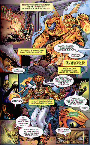
 Each piece is preceded by a nice one-page pin-up and introduction to the main character. Unfortunately the subdued, textured coloring of these pin-ups clashes with the saturated everything’s-shiny digital coloring of the stories themselves.
The (uncredited) lettering varies from one piece to the next, but it’s sometimes riddled with mistakes. I’m not talking about “its” vs. “it’s” mistakes that casual readers may not even recognize as errors, but stumbling sentences such as “For me it been a short time… but it been nearly over two millenia,” from a character who otherwise appears to be fluent in English. The font used in most of the pieces has commas that are difficult to distinguish from periods, and tiny apostrophes and quotation marks that look like they were done with a different pen. It’s distracting, which is one of the few sins a letterer can commit. And the choice of font to letter one piece - the logotype for “Star Trek: The Motion Picture” - is bad on at least a couple levels.
Another puzzling inconsistency is the price. Some of the promotional materials and the Diamond solicitation say “$12.95″, but the box says “$19.95″. So you might want to ask your retailer to check his invoice to see which it’s supposed to be.